Why Customize Email Signatures?
Creating a unified signature is the ultimate way to add polish to your emails. It exudes a sense of professionalism and clarifies communication. Plus it’s a great opportunity to re-emphasize your brand’s style and tone. When new employees join the team, creating their branded signature feels like a rite of passage that adds legitimacy to their emails with outside vendors.
Looking for ways to increase the professionalism of your internal and external communications? One way to add clarity and polish to your emails is with a customized email signature for all employees. We found this free HubSpot tool that makes the process easier than ever.
1. Choose what information to highlight
Before you get started, you’ll want to decide what information makes the most sense for your business to include. Name, phone number, website, and email address are all common practices, but if clients or customers frequent your location, you might consider adding in a physical address as well. Pronouns have become increasingly popular additions (she/her, he/his, they/them), and are great additions for inclusivity. If your business has a social media presence, adding icons and links can help to raise awareness.
2. Styling
This is also a great opportunity to put your brand guide to good use. Use brand colors in selected type, add in your logo, and decide whether or not to use headshots for an ultra-personable feel.
You’ll want to be sure to select a brand color that’s easily legible — this isn’t the time to use a tertiary neon hue for text! Choose one of your dominant brand colors to bring attention to the name or title of the employee, and use a secondary or tertiary color for bonus information like social media icons or buttons. In terms of font selection, if your brand font is readily available on most computers, excellent. However, if you use a more unique typeface, you’ll want to consider selecting a standard font that aligns with your brand. For example, most users have access to Arial on their computers, but if you chose Helvetica you’ll often find that only Mac users are seeing the correct typeface in your emails.
Most companies have multiple versions of their logo. In the email signature, you may just want to utilize your icon rather than the full version. Note that if you only use your icon, you’ll want to be sure to list the company name in the information. If the logo doesn’t occupy a roughly square space, your formatting might not sit as you’d like it to.
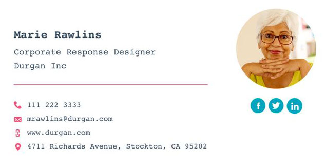
Adding employee headshots into the signature lends a personal touch. It’s nice to be able to visualize who you’re speaking to — it literally delivers emails with a smile. But, there are a couple of downsides to incorporating these. For one, you might have employees who don’t feel comfortable including their image, either because they’re self-conscious, or because they’d like to keep a bit of anonymity. While it’s never fun to talk about, another watch-out could be the possibility of discrimination. These are all considerations to take into account.
3. Putting it together
The easiest tool we’ve found for building email signatures has been through HubSpot. There are plenty of other signature tools out there, so feel free to explore. Another option is to create a signature image — designing out the full signature in Adobe or Canva, and simply placing the image as your signature. The downside of this? You’ll only be able to include one link. With text-based signatures, you have the opportunity to add in multiple links for emails, social, website, etc., and the phone number even becomes a link if the reader is on mobile.
Examples

.png)

.png)

%20(1).png)
.png)
.png)
.png)
